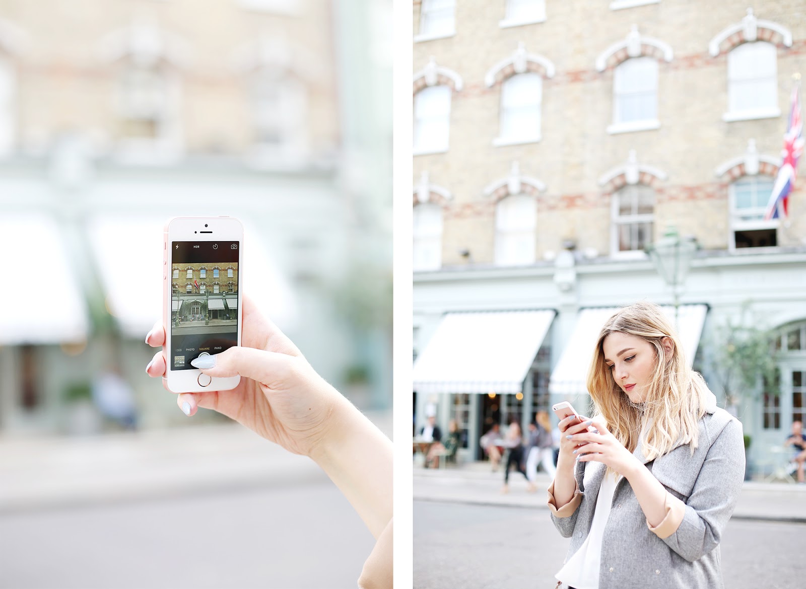
Instagram has always been my favourite form of social media within the few I find myself checking every day. I love photography and beautiful images so it's no doubt I end up refreshing my feed endlessly. Of course when it comes to my own profile I'm incredibly picky about the photos I upload - as I am with so many other things in life! It's taken me a long time to get the process down but I now have a set of steps that I follow each time I edit a photo that ensures they all fit together and satisfy my perfection driven little brain! Of course, my photos would be nothing without the apps they're edited on and there are three in particular that I couldn't be without..

VSCOCam Starting with the obvious, VSCOCam is my go-to when first approaching an edit. Although there are an array of editing tools on offer from Exposure and Contrast to Saturation and Sharpening, I actually find these far too bulky and not precise enough to really fine tune a photo. Instead I skip straight to the filters and leave the colour correction for later. A lot of apps offer different filters, but I find VSCOcam has the most aesthetically pleasing options available, whether you're after something bright and vibrant, dark and moody or a more akin to real film, they all make such a difference but are subtle enough not to detract from there photo itself. It's definitely worth paying a little extra to get the full set of filters, as there are so many more variations on offer than the original set you're given with the app. My favourites come from the H, S and F families but I really only stick to using one or two for more cohesion within my feed. My biggest gripe with the application of the filters is that you can only add one per image, but I like to get around this by saving the photo and re-uploading it again to run through the process a second time - although I wouldn't recommend doing this more than twice as you're photo is likely to lose quality the more times it's saved. |
Believe it or not, I use Facetune for just about everything other than tuning my face. It's the app I spend the most time with and the one that I find really makes a difference in the final outcome of my pictures. There are just so many incredibly useful things that it has to offer and the one app that I would liken most to using an actual photoshop programme thanks to it's 'finger scrubbing' action that allows you to select precisely which parts of the photo you want to edit, change or apply filters to.
The most used and most talked about is definitely the 'Whiten' tool. This is great for taking out stubborn yellow tones on white backgrounds, removing small shadows and reducing saturation from overly bright objects. The 'Smooth' tool works incredibly well at removing grainy areas from images taken in low light and 'Details' helps to sharpen text on product shots that might otherwise be too blurry or washed out to read while 'Patch' is the best for taking away stray marks on clothes, imperfections in a background or even removing the odd toe that might have sneaked in while photographing a flat lay.
My favourite and most used part of Face Tune though are the 'Filters'. I think this actually gets completely overlooked by most as the layout may lead you to believe it's just another set of coloured overlays à la VSCOcam, but actually it's the 'Lighting' part that I find absolutely invaluable. We all know I like a nice bright Instagram photo, and this tool allows you to scrub over any dark areas or shadows or brighten the entire photo on a level from 1-100, as well as giving you the option to darken certain areas that have become too over exposed.


MOSAICO Finally, this is the one where I put it all together. Although there may be an eye roll or two when it comes to the subject of planning your Instagram feed I think it's so important in creating balance to at least have an idea what to put where. The perfectionist inside me has deleted so many photos almost as soon as they were uploaded as it's only when everything comes together that it's easier to notice what doesn't quite fit. Mosaico is the app that all of you pedantic planners have been missing in your life. It allows you to import photos into a grid identical to Instagram and the best bit of all - you can actually drag and drop images into place, letting you to fiddle around with positioning for hours on end without having to constantly import and delete pictures. There's also the option to go into a 'ghost mode' where you can temporarily preview the removal of an existing photo in your feed if things just aren't looking right or you're considering taking out a post that isn't working! I just love the entire layout of the app. It's well designed, works smoothly and although there's not much else too it, the idea it's based on is so simple that it's become such a useful tool for me in planning when to post. |
|
|

Although some may like to take photos on a camera before importing into your app of choice, I like to stick to phone quality images as after all, that's what Instagram was originally all about. That doesn't have to mean skimping out on picture quality though. I've been using the iPhone SE for all my snaps on the go recently and love the way they look. Plus, it comes in rose gold and is just about the most beautiful thing ever!
If you're a big traveller and love to Instagram wherever you go I'd also highly recommend looking into your data plan. Wifi spots, although common, never seem to be exactly where you want them, but with Three's Feel At Home service you can actually use your regular internet allowance to upload whatever you fancy without having to worry about a huge bill at the end of the month!
